
 Infographics and complex data visualizations are among the most interesting new developments in publishing. New resources include: Infographics and complex data visualizations are among the most interesting new developments in publishing. New resources include:
|
Examples of great data visualizations |
 Ushahidi platform – A free open-source software platform allows citizen reports into a google map. An early example of this civic technology was when Kenyan bloggers showed where rioting and looting had erupted in presidential elections in 2008 to circumvent a government-imposed media blackout. Ory Okolloh, a Kenyan political blogger, asked readers to e-mail information about about incidents they had seen. The large number of enthusiastic responses led a team of Kenyan and European programmers — Eric Hersman, David Kobia, and Juliana Rotich — to assemble an application now available for free as Crowdmap. Ushahidi platform – A free open-source software platform allows citizen reports into a google map. An early example of this civic technology was when Kenyan bloggers showed where rioting and looting had erupted in presidential elections in 2008 to circumvent a government-imposed media blackout. Ory Okolloh, a Kenyan political blogger, asked readers to e-mail information about about incidents they had seen. The large number of enthusiastic responses led a team of Kenyan and European programmers — Eric Hersman, David Kobia, and Juliana Rotich — to assemble an application now available for free as Crowdmap. |
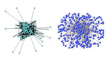 The Design of Deceit— Brandy Aven at Carnegie Mellon University found an interesting pattern while studying business communication in the corrupt corporate culture of the now bankrupt – Enron Corp. of Houston, TX. Legitimate Enron projects (right) involved e-mails that were reciprocal and widely shared, but emails about Enron’s illicit projects (left) were configured in a sparse network with a central clique and isolated external players. |
 Throw it Out the Window — Problems with food poisoning in China led history student Wu Heng to create a website in June 2011 called Throw It Out the Window (Zhi Chu Chuang Wai). The site maps food scandals nationwide from 2004 through mid-2011. It was created with the help of 33 volunteers from all over China and involves over 2,000 news reports. The crowdsourcing is open-ended, with an “I want to add” link inviting further contributions. Food Safety Today mentioned this in 2014. Throw it Out the Window — Problems with food poisoning in China led history student Wu Heng to create a website in June 2011 called Throw It Out the Window (Zhi Chu Chuang Wai). The site maps food scandals nationwide from 2004 through mid-2011. It was created with the help of 33 volunteers from all over China and involves over 2,000 news reports. The crowdsourcing is open-ended, with an “I want to add” link inviting further contributions. Food Safety Today mentioned this in 2014. |
 Growth of American newspapers — An intriguing historical visualization that plots over 140,000 newspapers published over three centuries in the United States using data from the Library of Congress’ “Chronicling America” project. Designed for the Stanford University Rural West Initiative by Dan Chang, Krissy Clark, Yuankai Ge, Geoff McGhee, Yinfeng Qin and Jason Wang. Note the drop-off of foreign language papers right after WWI. Growth of American newspapers — An intriguing historical visualization that plots over 140,000 newspapers published over three centuries in the United States using data from the Library of Congress’ “Chronicling America” project. Designed for the Stanford University Rural West Initiative by Dan Chang, Krissy Clark, Yuankai Ge, Geoff McGhee, Yinfeng Qin and Jason Wang. Note the drop-off of foreign language papers right after WWI. |
Other uses or similar crowd-sourced mapping projects include:
- The Christchurch (NZ) earthquake recovery map
- The Libya Crisis Map
- The Haiti relief map
- Safecast crowd-sourced radiation readings from the Fukushima nuclear power disaster.
More great sites and information on data visualization

Appalachian mountaintop removal
- Appalachian mountaintop removal and empathy upgrades — Google mapping techniques allow researchers to connect mountaintop removal mining with individual use of electricity. The project was developed by Matt Wasson and Jeff Deal of Appalachian Voices and Mary Anne Hitt of the Sierra Club.
- Making the complicated enivronmental issues clear through graphics.
- Envisioning fixes to the US federal budget by NY Times.com
- Top Secret America — an extraordinary datamap of US secret agencies and their activities done by the Washington Post.
- Thinking about map-making. ProPublica, June 4, 2012.
- Theoretical issues in data visualization and social networks. Nature. Aug 22, 2012.
- Visualizing polling data: Montreal Globe poll on Higher Education in Canada. October 2012.
- Union of Concerned Scientists Virtual tour of American nuclear facilities via Google Earth — Foreign Policy December 12, 2012.
- Products of slavery — Excellent map of worldwide slavery issues, also Slavery Footprint helps connect products to consumer information
- Sourcemap — Where things come from / supply chain information
- Land Portal – by the land governance / human rights community
- Cartography of the Anthropocene Age — Visualizations of global communication, transportation and energy flows.
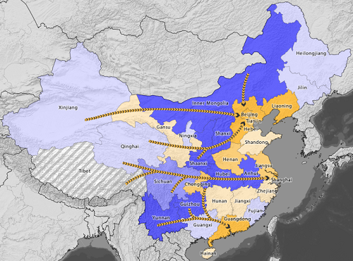
- Restless America — Easy to grasp visualization of where Americans moved to and from in 2012. From Vizynary – storytelling with data.
- Mapping China’s Dam Rush — Wilson Center
- Statistics on mortality — Bloomberg
- Charles Minard’s map of Napoleon’s march on Moscow. Considered to be the greatest info-graphic in history.
- Housing through the decades. Interesting approach to a timeline.
- Info Amazonia — Visualizing the rain forest