The object here is to design an attractive & interactive pdf and/or ebook using InDesign (or similar graphics applications). Once we have finished our InDesign book, we’ll export to an interactive pdf.
Be careful to maintain the internal links between your photo, illustration and font files on the one hand and your InDesign document on the other hand. This means putting photos, illustrations and (sometimes) fonts in one folder along with your document and not moving them around. There is a pallet under Windows where you can check your links.
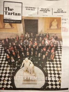
Exporting without these links creates bad headlines and photos that look like this Feb. 28 issue of the Radford University Tartan.
 Why not just use Microsoft Word for graphics?
Well, you can, but there’s a lot less control.
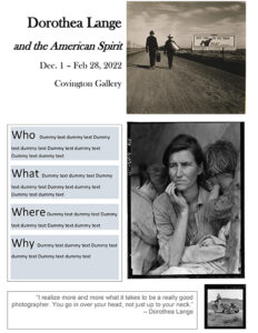
Here’s a one page flyer for a gallery program that was done in MS Word. You can see that it has problems. For example, the grey text boxes are not spaced regularly, and the bottom tier doesn’t have an exact white space between it and the next group of illustrations. These are the sorts of things that may not be obvious to students but are signs about a lack of training and experience.
It’s best to use Adobe Indesign or some other graphics application when putting together flyers, reports or other kinds of publications, both for print and for digital distribution.
For more about publication design and graphics, see this related set of pages in the Visual Communications class.

